Smpl’s User Experience (UX) expert, Tore, is a master of creative design. He looks at the secrets behind great digital design, and explains how you can make sure your platform, product, or service is built exactly the way you want.

1. Understand the Rules
Often, clients see ‘design’ in terms of the look of their product or service, but great digital design is so much more than that.
Great design is founded on rules… the look can come later.
Your own set of design rules is what will harmonise the many different elements that go into your digital product or service.
These rules will not only tell you what something looks like, but why it looks like that and why it interacts with another design element in a certain way.
These rules will apply to everything from buttons, text styles and body styles, to margins, sliders, forms, headers, footers, and all the rest.
They will bring order, predictability, and efficiency – and hence cost savings – to your design.

Anyone can make something look pretty with nice colours, but it’s the rules that will make sure your user can reach a button on their smartphone screen easily with their thumb – something that might make the difference to whether they use your service again.
So, whenever you are deciding on the right designer to bring your Big Idea to life, make sure they are willing and able to tell you all about the rules they will apply to your product or service. If they just want to make pretty pictures, move on.
2. Pick a designer who uses a design system
Applying the rules of your design will be quicker, easier, and cheaper if your designer uses a design system.
Sadly, very few do. Fortunately, Smpl does!
We create bespoke Smart Component Libraries for our clients because it completely changes the speed, efficiency, and quality of service we can deliver.
Your component library is that collection of user interface (UI) elements, such as the design of buttons, the selection of fonts, and other typography and visual elements.
It’s crucial you don’t designers build this manually. Let me explain why…
A design system uses technology to create a living, breathing style guide for you. It will bring your rules to life and determine how different elements of your design act – be they buttons, forms, overlays, text, colours, images, or whatever – either by themselves or in harmony with other elements.
Find an agency that uses a design system. You’ll get a better product and you’ll get it faster, cheaper, and with less stress
Tore Tuen
Traditionally, a designer would create and build every element of your design separately, at considerable expense. In contrast, a design system gives you a set of reusable elements that you can quickly tailor in an infinite number of ways.
Instead of having to design 40 different buttons, for example, a design system allows your designer to create a set of rules and then a single button onto which they can drag and drop different elements, dependent on the need of your product.
The other HUGE advantage of a design system is it can interlink and automate everything inside your design. This means that if you want to make a change to your design, that you can make that change and then apply it across your platform, all at the click of a button.
Don’t like blue buttons? OK, let’s make them green and see how it looks. Click. Done. What do you think?
Without a design system, the process of making that change and applying it across the platform could take hours, if not days… and lots more money.
All these advantages are equally helpful when it comes to building your digital product. It ensures both designers and engineers can build your platform, product, or service in a much more responsive, easy, quick, cost-effective, and low-stress way than using traditional methods.

3. Be ready
It’s much easier for a digital designer like me to bring your platform, product, or service to life if you have gone through some kind of internal discovery phase before you bring the idea my way.
By that, I mean two things; firstly, that you have thought about different versions of your Big Idea and decided which would be best (to solve the problem you are trying to fix for an audience you have identified).
When clients come to us with two (or more) ideas in their head it’s usually because they are super keen to get started but haven’t really thought through what they want to get started on.
If you rush to get started, it will not save you time or money.
In fact, there’s a good chance it’ll take you twice as long and cost considerably more to design and build your product, as multiple ideas and misunderstandings get batted backwards and forwards.
That said, if you’re armed with nothing more than passion and an idea, that won’t be a problem at Smpl. We offer an expert business advisory service and workshops to ensure these questions are ironed out (and that you ‘don’t create a monster’, to quote our Head of Development, Andras).

The second part of internal discovery is your own set of company design rules.
It’s always helpful if you have a style guide or company design profile that we can apply to your product or service. By that I mean a logo, brand colours, rules about where to use them, and so on.
The more descriptive the rules are, the quicker and easier we will be able to create a style for your digital product.
Of course, if you’re a start-up and don’t have any of this, don’t worry. We have some awesome brand and design specialists who can create all this for you if you need it.
4. Understand the process
Some designers will act as if they are practising some secret, mystic dark art. Usually that’s to cover up for their professional inadequacies or to charge you as much money as possible!
But it’s easier for everyone if you understand what is going to happen and when.
The process is not complicated. I break design into three phases:
- Discovery
- Flow
- Dev-ready
In the discovery stage we talk about your idea, the problem you are trying to solve, and how your platform, product or service will do that.
At this stage nothing is set in stone. We will explore ideas together to make sure you get the foundations right for creating something that will surprise and delight your users.
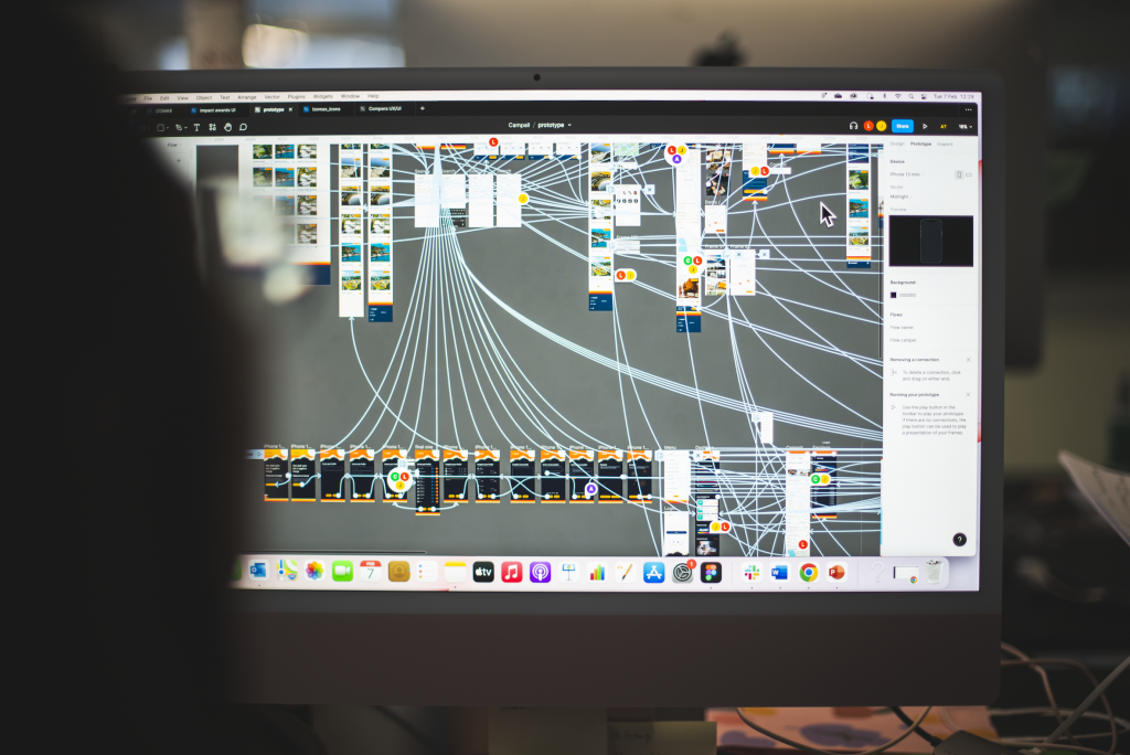
Then, at the flow stage, we define, prioritise, and build the key processes – or ‘flows’ – that will offer practical solutions to the issues, problems, and opportunities that you have pinpointed in the discovery phase.

For example, our client Campall has the goal of becoming ‘the AirBnB of camping’.
As such, we started by defining a core flow that, in their case, was one that easily allowed customers to search and book their holiday. Once we established that, we could start working on other flows, like creating accounts, editing choices, and so on.
At the dev-ready stage, we will bring all the prior work together and build you a fully functioning prototype. We will use this to finalise and polish your digital platform, product, or service before sending it to our engineers to build.
5. Ask a key question before you move from design to build
That question is simple:
Does what we’ve created solve the problem we set out to fix?
You’d be amazed how many people fixate on how their product looks, but don’t seem to care if it will actually help customers.
You’ve got to avoid building a solution that looks and feels amazing but which is in need of a problem. That is the fast-track to failure.
It’s a simple lesson, but it’s crucial.
6. Test your design
Even if you have solved a bone fide problem (as per point 5), you still need to check you’re doing it in the way people want.
Your stakeholders, investors, or customers may not understand the principles of design, but they will, for example, have strong opinions about how they sign into your platform.
Get out there and ask customers, friends, and family what they think. Talk to anybody who could conceivably be your audience. You might find they have a completely different idea to you about what works.

I once had an onboarding process for a client that felt too complicated. So, I went to a café and just asked some people (who fitted our user demographic) what they thought.
One person thought the onboarding process was too long. She liked the gamification I’d employed, but lost interest and stopped at stage 5 out of 13. Another really enjoyed the gamification and had no problem with the longer process.
This told me the gamification worked but this key process needed to be shorter.
If you talk to people, they will tell you all sorts of interesting things. And those things might be the difference between a product or service that is a huge success, and one that fails.


