Jingjing Li, our User Experience (UX) expert, explains how to develop a digital prototype that is flexible, futureproof, and avoids the usual costs, delays, and stress.
Prototyping is crucial to the development of any digital platform, product, or service.
Your prototype – and the process by which it is made – will be what determines the success or failure of your project.
If you follow the steps below (or at least get your designers and developers to) you’ll be ready to unleash a successful digital product or service on the world before you know it.

Understand the lie of the land
Despite its critical role in the process, you’ve got be very careful how you create your digital prototype because LOTS of agencies get it wrong.
The reason there are so many problems with building prototypes is the digital design & development industry has grown up in a way that doesn’t serve you properly.
The sector is highly disjointed. When you want to build a digital solution, you have to navigate expertise in three different silos – and often three different companies – which can be time-consuming, contradictory, and expensive.
Smpl is one of the few integrated agencies, meaning all the creative design, UX, and development experts you need will be in the room from the very start.
This makes a huge difference to the success of your digital protype (and your final product or service).
Below I’ve detailed how we do it. And, no matter who you employ to make yours, demand they go through these steps:
1. Get to know your users
Before you start to create your digital prototype, the most important thing to do is make sure you understand your users.
We will work with you to create several user personas before we do anything else. This is done by:
- talking to team members from across your organisation
- testing the idea on as many current or prospective users as possible
We do this to understand:
- why users would want a product or service like yours
- what needs users feel aren’t being served in the market (or served inadequately)
- what problems users have that we can solve
You’d be surprised how many companies don’t do this properly. It’s the main reason SO MANY digital products and services are built to meet needs that don’t exist.
These inevitably fail.

When you are creating your user personas / groups – also known as ‘segmentation’ – be careful not to fall into the common trap of false categorisation.
It’s all too easy to just say ‘Oh, someone is X age, Y gender or in Z job’ and then draw conclusions from that.
This is a mistake. People do not neatly fall into these categories.
These categories can be used as a guide, but you need to empathise with your audience as real people.
However diverse they might be, you need to find shared needs that you can serve.
For example, you might find a common problem is your audience doesn’t trust the existing platforms in your space.
If that were the case, you’d have to bake credibility into how your service works, perhaps through using industry influencers, or other prominent forms of social proof.
Alternatively, you might find a common issue is the audience struggles with too many sources of information. In this case you might think ‘part of our solution should be a pinning option where users can collect what they need’.
Prototyping is about learning, finding gaps or opportunities, and making things better for the user
Jingjing Li
2. Check out on the competition
Understanding your potential rivals is crucial to creating a digital prototype.
Check out similar offers and find out what is good and what is bad. Then ask:
- What can we learn from them?
- What do they do well or badly?
- How can we take what they’re doing and do it better?
Focus primarily on the user experience, rather than on the design of rival services (i.e. how they look and feel). Ask questions like:
- What functions do they have?
- How does the user like to use it?
- What makes it convenient or difficult to navigate the service?
Remember to think about this in the context of your audience. For example, using Google Maps may make it easy to navigate an app, but if the reviews and pictures that it surfaces aren’t of any use to your audience then it will be a hindrance, not a help.
There’s no need to worry about being 100% original. You don’t need to reinvent the wheel. It’s fine to build on what has come before you.
Prototyping about learning, finding gaps or opportunities, and making things better for the user.
As Smpl co-founder Lasse – who built his own billion-dollar company – says: ‘People with unique ideas often have stupid ideas’.

All this will be much easier if you use the integrated approach I mentioned earlier.
Make sure your experts are in the room alongside your agency’s UX experts, designers, and developers from the very start.
If you don’t, you’ll quickly get mired in confusion and complication.
3. Minimise
You’ve probably got lots of ideas about all the great things your product or service is going to deliver.
But at this stage you’ll need to strip everything back to find the core of your offering – the beating heart of your product or service.
This is your Minimum Viable Product, or MVP.
Often clients come to us with lots of functionality that they want to pack into their prototype but, as our Head of Development, Andras, puts it, ‘don’t create a monster’.
You need to restrict yourself to covering key functions and establishing hierarchies on which you can build everything else.
You should ask things like:
- what are the key tasks a user needs to perform?
- what journey will they need to take to perform those tasks?
- how do we make it as easy as possible for users to do that?
If you stay focused on getting the core offer right, then you can start adding bonus functions later on. Again (and I can’t say it enough) having an integrated approach, where the owner (i.e. you), users, designers, UX experts, and developers are all involved is crucial.
It will mean everyone is on the same page and working towards a common goal.
4. Keep it simple
All-too-often agencies will try to make you run before you can walk when creating your first prototype.
They try to get you to spend as much time on prototyping as possible. That’s money in the bank for them.
Instead, take your MVP and create a lo-fidelity, clickable version before you build the all-singing, all-dancing version.
There are two reasons for this
- It gets the idea out of your head and into the world. We promise a 5-day clickable prototype because it starts to make the dream come true almost immediately. This is great for you, but also shows your stakeholders you are making progress and keeps them engaged
- Often, you’ll get insight from a quick prototype that changes how you look at your solution. We’ve done prototypes for clients where they’ve looked at the lo-fi version and it’s completely changed their approach to what they need
Getting this right will make building a hi-fidelity prototype (followed by your final product or service) easier, quicker, and cheaper.
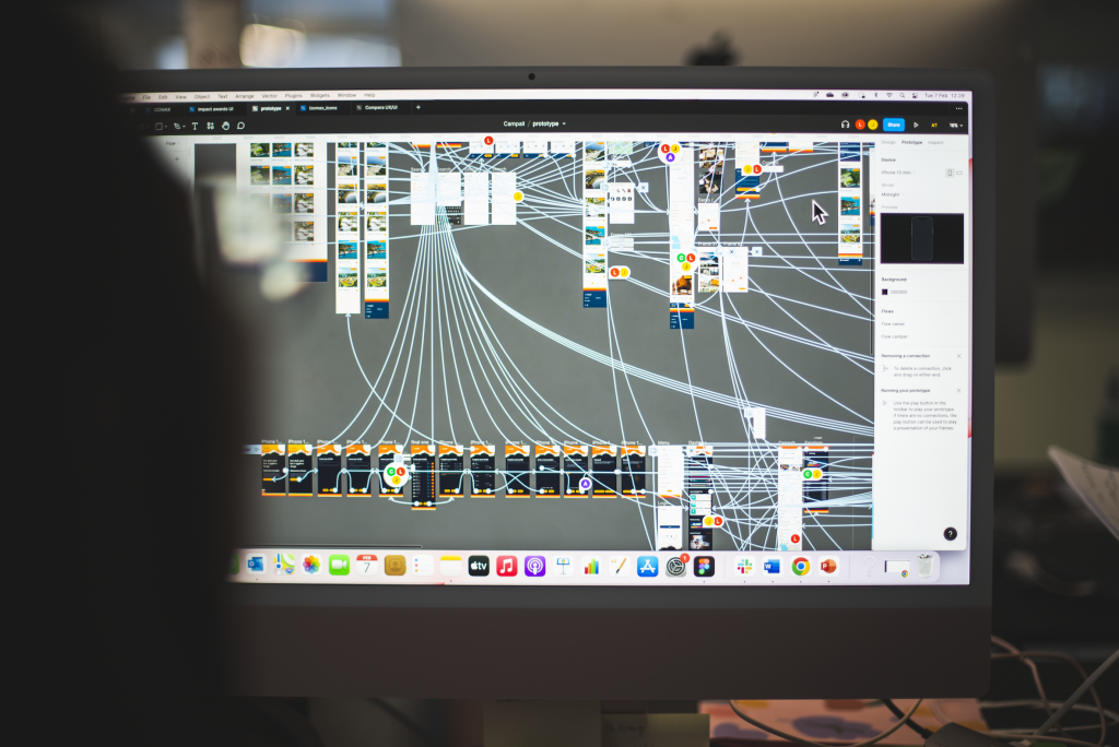
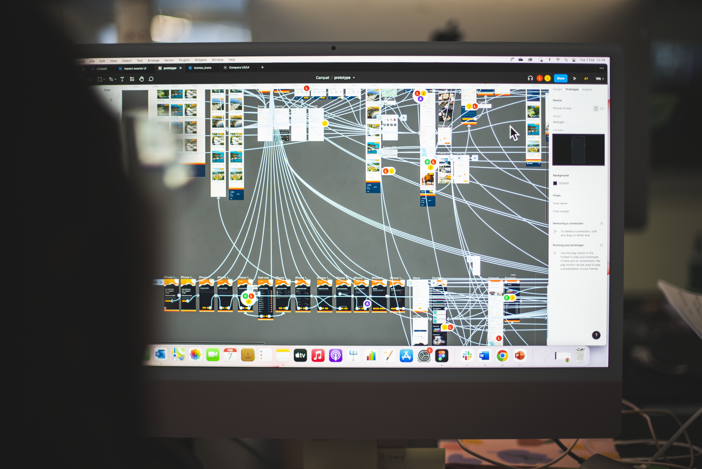
Oh – by the way – when we say ‘keep it simple’, there’s still A LOT going on behind the scenes… Check out the schematic for one lo-fi prototype I’ve been working on:

5. Function first, style second
Many clients want their early prototypes to have design ideas and branding integrated straightaway.
It’s understandable that people want to see how their digital baby is going to look, but beware putting style before substance.
Great looking creative design can and should be developed in parallel to how your product or service functions.
However, functionality must lead the way as that will impact the style of your final product. (This is true no matter how carefully your brand or style guide dictates look and feel.)
6. Go from lo-fi to hi-fi
This is the stage where we fix issues revealed by your lo-fi prototype and then add all the necessary functionality, design, and style.
Because you’ve already built your MVP prototype, we’ll have spotted any major problems and jumped on the opportunities it has presented.
This means we’ll be in a much better position to build a hi-fidelity prototype that serves your – and your users’ – needs in its initial iteration.
Crucially, following our process will mean your prototype has future requirements and functionality baked in, so they can be easily integrated later. This flexibility will ensure big gains for you later.
We recently had one client who realised at the lo-fi (MVP) stage that they were going to begin by delivering their service as a website, but it would probably turn into an app soon. That big change would have been much more difficult if we hadn’t followed the Smpl process.

Almost there!
Your hi-fi prototype will be very close to your final product. Once it’s built, we will rigorously test it to iron out any remaining design and functionality issues.
Then the developers can take over and follow the roadmap for the final product that we’ve all agreed.
One thing developers hate is being asked to make constant small changes as they build. If your needs change then you must do them, but our process will hopefully mean these changes are few and far between.
This will save you lots of time and money. And before you know it, you’ll be surprising and delighting customers around the world!


