
Is the battle between UI designers and developers finally over?
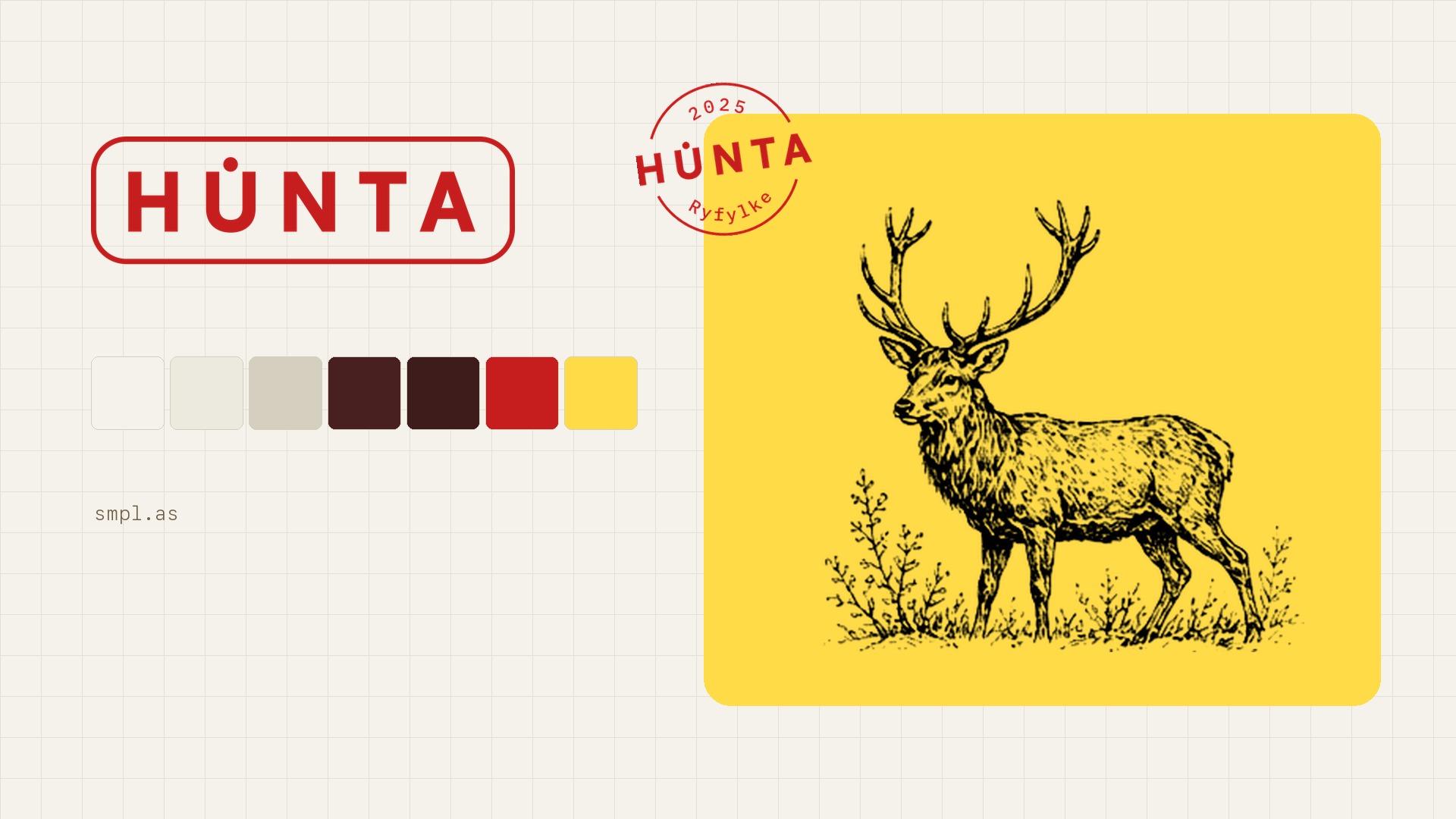
For time immemorial, designers and developers have battled over digital UI. Designers made pretty pictures - logos, buttons, and the other key components that make up a design system - and the developers had to translate the pretty pictures into code.
Cue an inevitable battle between designers who think every pixel matters and developers who think the designs are not practical. That this is not time well spent.
The losers? The companies spending a ton of money and time on UI work that ended up as unused PDFs.
Now, using our highly-skilled designers we can bypass all of that trouble. We just give developers everything in code. Fully front-end ready. No translation required. No stress. No time wasted.
Here's the story of how we brought peace ....ironically, through an app for hunters.
From JegerHub to HUNTA without the typical pain.
HUNTA is a Norwegian marketplace that connects hunters with the landowners whose terrain they want to hunt. It used to be called JegerHub. When the team announced the change, they explained that the old name no longer matched where the product was heading, and that they wanted something shorter and sharper that felt at home both on a Norwegian mountaintop and on a screen anywhere in the world.
They asked us to build the new identity in, shall we say, a quite limited time frame. So we did key parts by hand in Figma and then exported into a real, coded design system rather than a static file for someone else to rebuild later.
That second part is the one worth talking about. On most redesigns what can be frustrating is waiting for a developer to recreate what the designer has created. A brand designer makes a kit, a product designer turns it into screens, a developer rebuilds those screens in code, and eventually someone puts it online. Each step loses a little of the original intent and adds another "we'll sort that out later." We ran the whole thing from Figma to GitHub with one product designer.
It starts by hand, in Figma
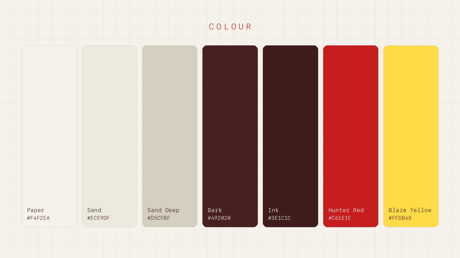
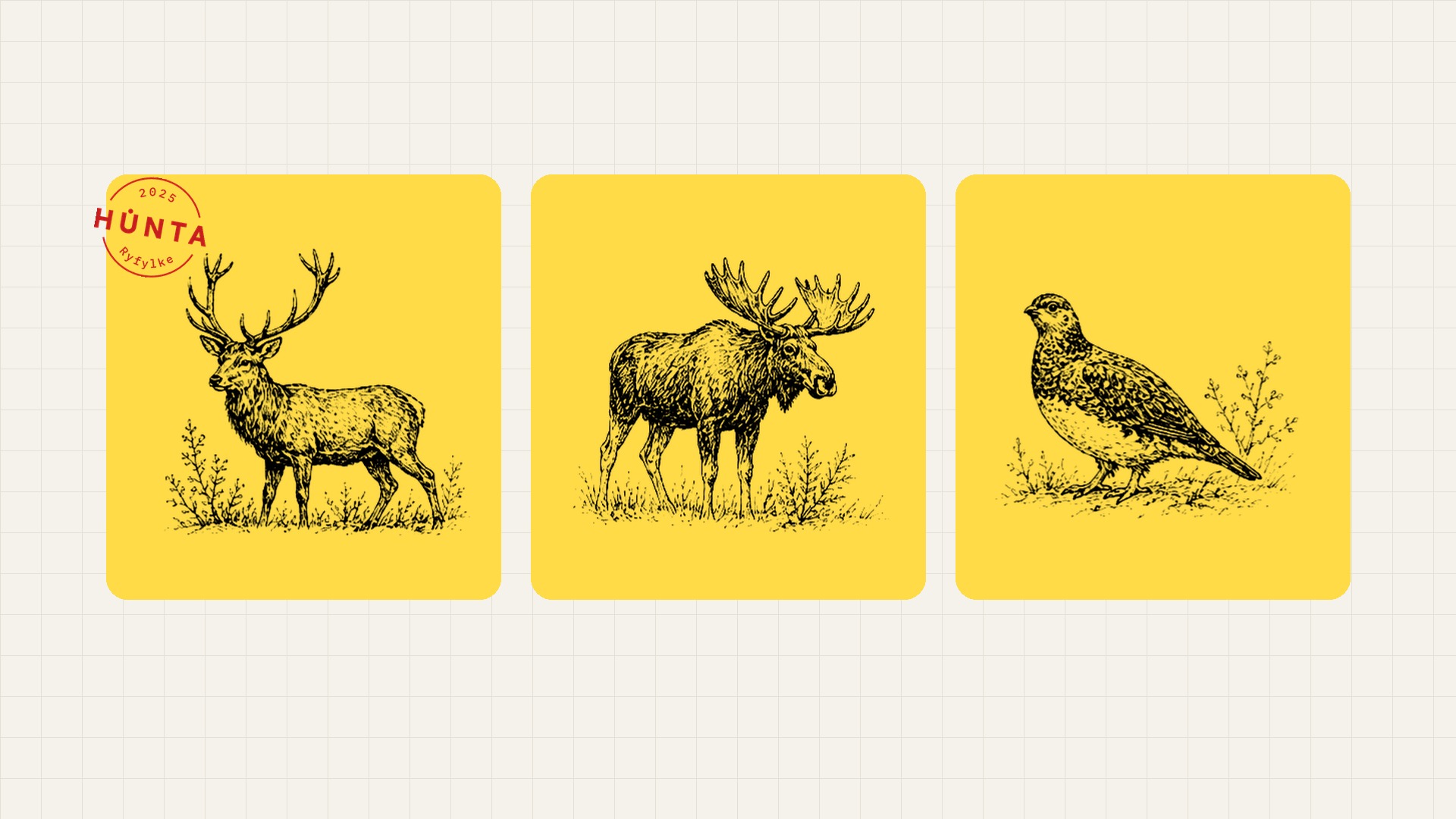
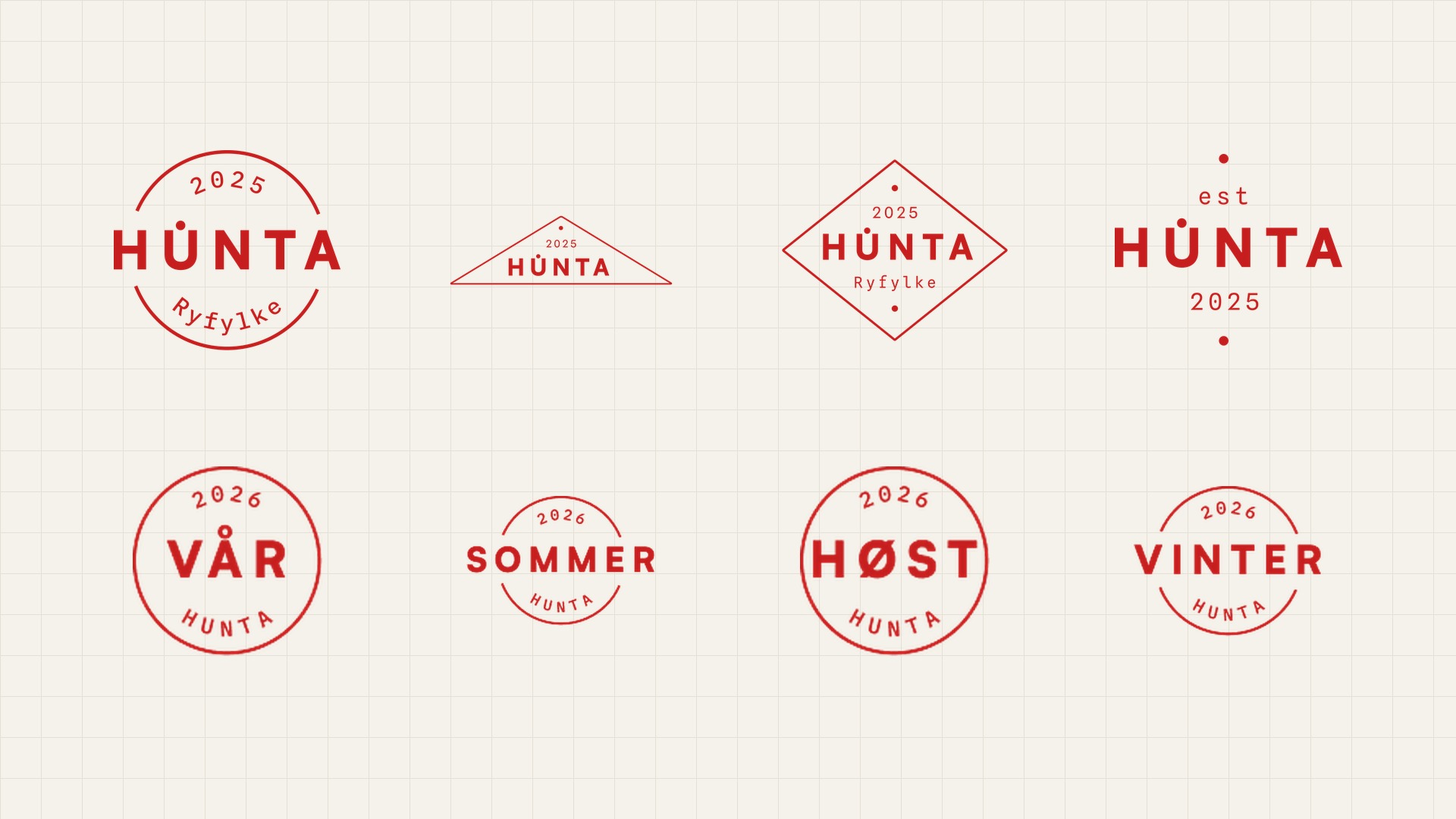
We started in Figma. A designer built the fundamentals by hand: wordmark, an earthy paper-and-ink palette, accent colours, a set of stamps, and a field-guide illustration style.
The direction came straight from the brief. HUNTA wanted the app to feel like "a notebook you actually trust", the kind that survives a season in the field.
You don't need to be a Figma expert for this part. Figma just holds the decisions a person makes, like a logo, a few named colours, a type pairing and a handful of components. That is enough to start building.
From a Figma file to a design system in code
Next we made a small figma file with only the essentials downloaded it as a .fig and gave it to Claude Design to turn the kit into a structured design system.
We set the direction and made the final calls. When something looked off we said so in plain, slightly Norwegian English ("too much brown", "the swatches don't read as colours", "make the testimonials feel like field notes"), and it made the change so we could look again.
From styleguide to a live front-end
A styleguide doesn't help much if it's only a PDF that's being actively ignored by the developer. What we made was a React app with real components, design tokens, and a working front page we called Feltkart (Norwegian for "field map"). -This all made it inexcusably easy to implement,
Claude Code wrote it, ran it, took screenshots of its own work, and caught and fixed bugs as it went. One is a good example. Someone reported that the colours "didn't show up", but only in Safari. Claude traced it to a newer CSS feature the pale swatches relied on that Safari wasn't handling, and replaced every use of it with a fixed value that looked identical. Same result in every browser, without the fragile dependency.
Every change went through the same short loop: edit, build, check it in a real browser, commit to GitHub, deploy to Vercel, and it was live in about half a minute.
Keeping everything in GitHub meant a clean record of every decision and nothing stuck on one person's laptop. Deploying to Vercel meant there was always a real URL for the client to react to and see the design on a real phone or laptop browser rather than a mockup in a slide.
Why the loop matters
None of this is really about whether AI can design or write code. What mattered was how short the gap got between having an idea and seeing it live.
For example, we got some feedback from actual hunters, we can't share what they thought the original "U" in the word mark looked like, but it certainly inspired a change.
We made the change to the logo wordmark and updated it across every lockup and stamp instantly. Feedback went straight into the design system instead of a backlog.
What this actually changes
For a service redesign, the usual constraints are coordination and cost/time. You need a brand person, a product designer, a developer, and enough calendar to pass the work between them.
When those steps fold into one loop, the sums change. One person with good judgement can take a project from rough idea to live site, directing while Claude builds the design system.
It's worth being clear about what this isn't. It isn't "good design is now cheap", and it isn't a way to manage without designers.
We can't stress enough how taste and the decisions are still human, and they still start by hand in Figma. And that will make you stand out from all the purely AI generated designs out there.
What gets cheaper is the rollout: the slow, lossy handoff from a design file into working code. What you keep at the end is a design system your team can actually build on, versioned in GitHub.
The result
HUNTA wanted an identity that, in their words, "feels familiar and dependable, but belongs in 2026": the old logbook brought into modern type and colour.
That is what is now live, along with the design system and the front-end underneath it, all built in a handful of sessions and all in code their team can keep working on.
You can see it at hunta.no/en. We kept hold of the design decisions; the tooling just took out the slow part in the middle.
FAQ, modern product design process using Figma and Claude
Where do I start?
Start in Figma. Create only the essentials: Logo / wordmark, Colours, Type styles, Buttons, Cards, Key components. Benefit: By starting in Figma you'll make sure you stand out from all the AI-generated purple gradients of the world: taste, tone, hierarchy and brand feel.
Do I need a huge design system in Figma?
No. Start small. A clean Figma file with the core decisions is enough. The HUNTA project started with the essentials, then moved into code. Benefit: You avoid spending weeks making a perfect Figma library.
How do I turn the Figma file into something interactive?
Once the visual foundation is established in Figma, you can use AI-assisted tools such as Claude Design or Claude Code to translate design decisions into code. Instead of creating static mockups, you begin generating reusable components, design tokens, and layouts that can be used directly in the product.
What is a coded design system?
A coded design system is a collection of reusable components and design rules that exist in code rather than only in design files. Buttons, forms, cards, navigation elements, colours, and typography all become real building blocks that developers can use consistently throughout the application.
Why move the design system into code?
Moving the design system into code creates a single source of truth. Designers and developers are working from the same components rather than interpreting screenshots or specifications, which reduces misunderstandings and speeds up development.
Why use React for the design system?
React makes it easy to create reusable components that can be used across multiple pages and features. When a component is updated, the change can be reflected everywhere it is used, making maintenance significantly easier.
Where does GitHub fit into the process?
Its answer.
Why deploy to Vercel?
Its answer.
What does the ideal workflow look like?
The ideal workflow starts with visual direction in Figma, continues with AI-assisted conversion into reusable code components, stores those components in GitHub, and deploys them through Vercel, Railway or other hosting. Feedback is then gathered directly from the live product and fed back into the system, creating a continuous cycle of improvement.
Does AI replace designers?
Its answer.
What do I end up with at the end of the process?
Its answer.
What is the biggest benefit of this approach?
The biggest benefit is that design moves much closer to reality. Instead of handing designs over and hoping they are implemented correctly, teams can work with real, interactive components from the beginning, reducing friction and dramatically increasing speed.

About the author
Andreas Melvær
Managing Director & Co-founder, SmplCo
Andreas is the MD and co-founder of SmplCo. A product nerd at heart, he leads the company's 5-Day Prototype service and has helped 150+ startups and enterprises turn ideas into working digital products. He builds with AI, ships with speed, and occasionally wins marketing awards.
LinkedIn →Keep reading

The 2 most important questions you can ask yourself before pitching to investors
What's the most common mistake founders make when they pitch? Putting features before benefits. Here's the simple two-question exercise that fixes it.
Without a Design System, AI Just Helps You Make a Mess Faster
Vibe-coded internal tools arrive fast and arrive different. A central design system is how an organisation keeps the speed of AI-assisted building and stops the fragmentation.
The most important UI trend? Trust.
AI makes it trivial to ship a working app. It also makes every app look the same, and users can feel it before they can explain it.