
AI Masterclass Series
Keep the speed, stop the mess
Remove the chaos factor from your AI plans. Build one system that makes sure everyone, and every agent, builds tools that are consistent, useful and actually used. Without it you end up with 50 tools, 50 different interfaces and 50 different ways to upset everyone.
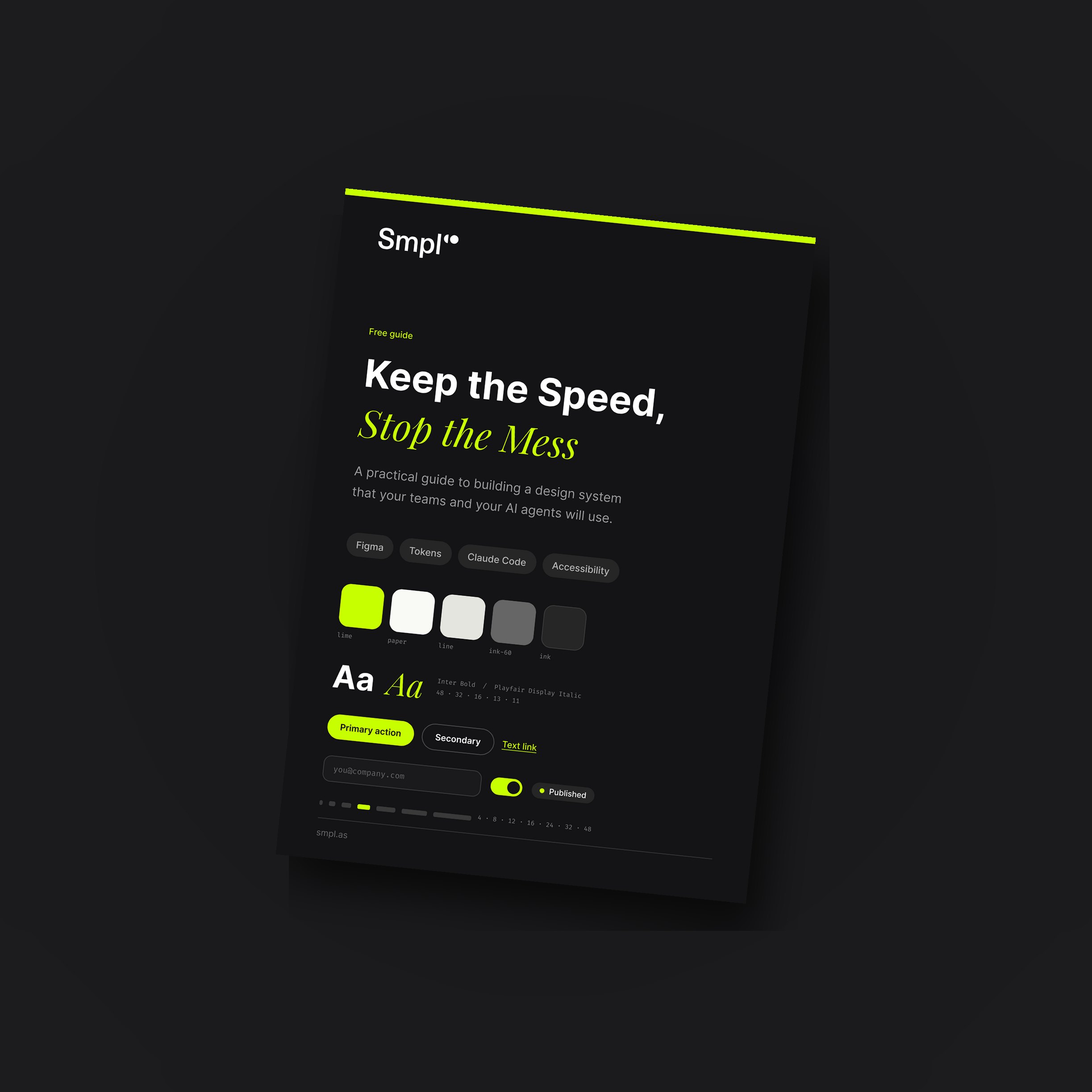 Get the free guide
What's inside
the guide
We build every AI-assisted tool on top of a design system, and we have created them for start-ups, corporations and everyone in between. This is the short version: what breaks first when teams dive into AI, the eight essentials, what a design system actually looks like, and how to plug it in.
Is AI adoption part of your KPIs?
95% of AI projects deliver no measurable value. Most companies hit the same wall: every team uses AI differently, results are patchy, and the promised gains never show up.
When AI goes bad
Get the speed wrong and you get 50 tools, 50 interfaces and 50 ways to upset everyone. Accessibility, adoption and your brand are the three things that break first.
What does a design system actually look like?
Four corners of a real client system: colours with roles, a named type scale, every button state, and one way to navigate.
But where do I start?
You do not need a 200-component system on day one. Eight places inform most of the trust and usability you will need.
Plug it in
How to go from nothing to a design system that is embedded, operationalised and working every day. Five steps, including the file your agents read first.
But where do I start?
You do not need a 200-component system on day one. You just need the essentials. Here are eight places that inform most of the trust and usability you will need.
Colour
Roles, not just swatches. Surface, text, action, warning. Check contrast.
Type
Two families, five sizes, and a line height you never argue about.
Spacing
One scale, 4 or 8 based. Every gap and padding comes from it.
Buttons
Primary, secondary, destructive. Hover, focus, disabled, loading.
Forms
Inputs, labels, help text, errors. The state most tools get wrong.
Navigation
Where search lives, how you go back, what the current page looks like.
Empty zero states and error states
Nothing here yet, something broke, are you sure. Written once, reused.
Voice
How labels, errors and confirmations sound. The way your company talks.
What does a design system actually look like?
A good design system defines how things should look, behave and fit together, making products faster to build, easier to adopt and far more consistent. When you build a real one, you find yourself with rules that look like this.
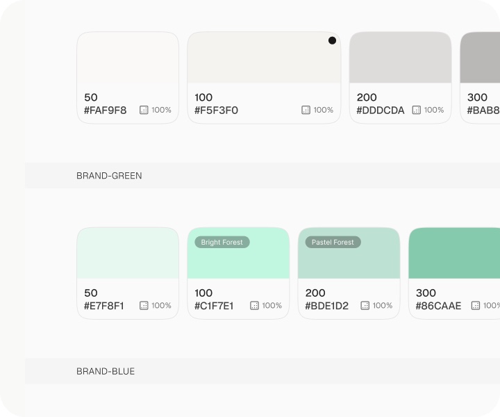
Colour with jobs
Describe what roles the colours have. What is the brand colour and what is a highlight?
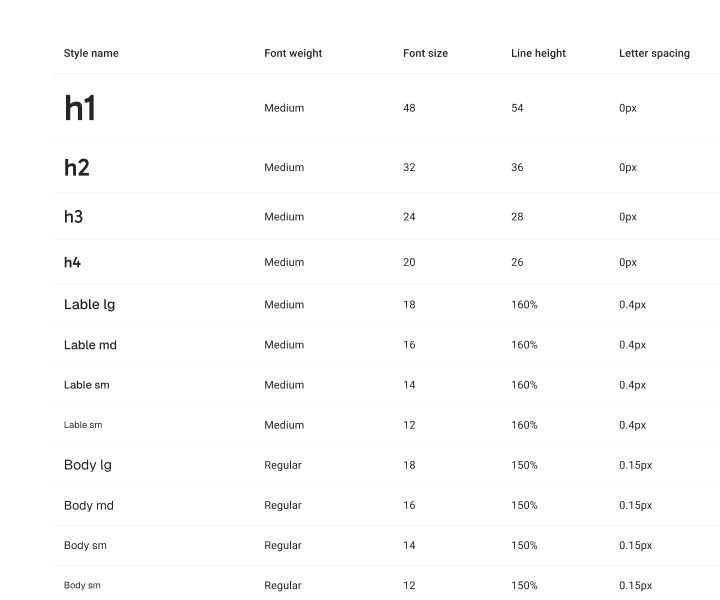
Type decided once
A named scale with size, line height and spacing. "h1" means one thing everywhere.
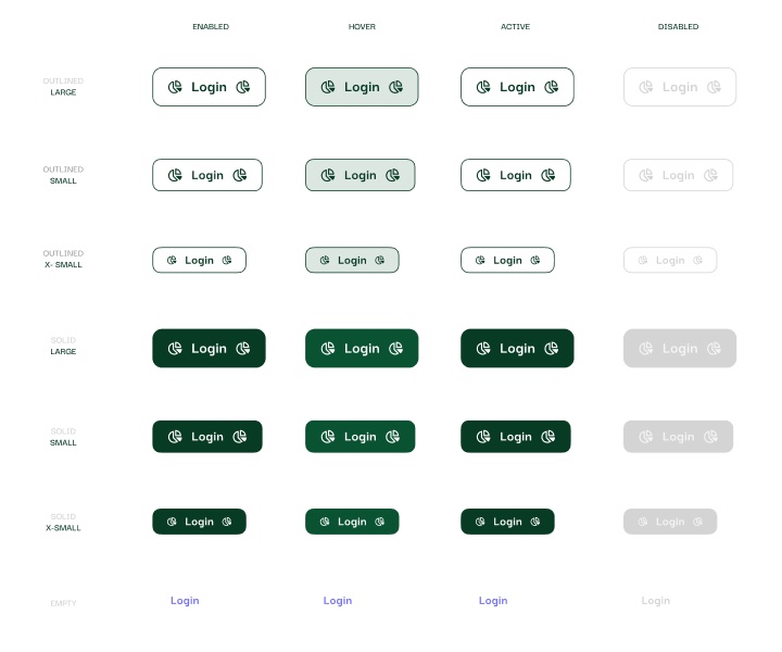
Every button state
Primary button? Secondary button? Make the right button appear at the right place.
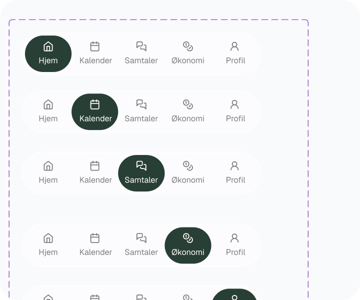
One way to navigate
Users should focus on learning what the tool does, not a new way to navigate every time.
Plug it in and watch the magic happen
Here is a simple overview of how to go from nothing, to embedding and operationalising a design system so it goes to work every day, selflessly making sure your plans succeed.
- 1
Design one real screen in Figma
Get creative. Mock up your ideal screen based on a platform that is already key to your organisation, ideally something management uses every day. Work with it until it looks awesome, using the eight essentials.
- 2
Show it to your AI and let it ingest your work
Use the Figma MCP to let your AI agent pull details straight from the file. Suddenly colour, type and spacing become variables the code reads.
- 3
Build the eight essentials into components
Now build all the rest of the components your organisation is going to need. You can revert to Figma or build with AI.
- 4
Shove it in a repo
Take the newly coded design system and put it into its own central repository, for example on GitHub. This is now your one source of truth.
- 5
Tell your agents the rules
Create a short design-system.md the agent reads before any UI work. Which tokens, which components, what to do when one is missing.
For Claude users: put this in CLAUDE.md
Read design-system.md before you build any UI. Use only the tokens and components it lists. If something is missing, stop and ask. Never invent one.
Get your free Design System Guide
Seven pages on removing the chaos factor from your AI plans, with snippets from a real client system, based on the systems we run ourselves and the ones we have set up with clients.
Get the free guide
Seven pages on creating a design system your teams and your AI agents will actually use, with snippets from a real client system.
Common questions
What is a design system?
One source of truth for how software in your company should look and behave. It starts with foundations such as colour, type, spacing and voice, goes one level up into a component library of buttons, forms, navigation, cards and empty states, and then into patterns: how search works, where filters live, what a status colour means. The part most people miss is where it lives. A Figma file is not enough; it has to reach the repo and the agent.
Why does AI-assisted coding need a design system?
Because unconstrained generation defaults to generic patterns and quietly breaks accessibility. Without a shared standard every AI-built tool becomes a new interface to learn, contrast and keyboard paths fail, and the brand erodes into something faintly untrustworthy. A design system encodes the non-negotiables so every new app starts compliant and recognisable, at the speed of generation.
How big does a design system need to be to start?
Small. Colour, type, spacing, buttons, forms, navigation, empty and error states, and voice. Those eight inform most of the trust and usability in any interface. Add components when three teams have built the same thing themselves, not before.
How do you make an AI agent use the design system?
Put the tokens and components in the repo where the agent works, and write a short instructions file it reads before any UI work: which tokens, which components, and what to do when one is missing. Reference it from CLAUDE.md or AGENTS.md. Then add checks: a lint rule against raw hex values, a contrast test, and a review that asks whether the change uses the system or invents a new one.
How do you make a design system stick after launch?
Give it one owner rather than a committee. Open a front door for changes: propose, review, publish, changelog. Version it so tools can pin a release and nothing breaks silently. Set an accessibility floor and treat it as non-negotiable. Measure adoption, meaning the share of screens built on tokens and the number of distinct button styles in the company, rather than checklist compliance. Review quarterly and leave it alone in between.
What accessibility standards should the system enforce?
A contrast ratio of at least 4.5:1 for normal text, visible focus states on every interactive element, a label on every input, and a keyboard path through every form. Those four catch most of what unconstrained generation gets wrong, and they map directly onto WCAG AA and the universal access rules most organisations are already bound by.
How long does it take to build a design system?
Less than you think, if you keep it to the essentials. Design one real screen in Figma, let your AI ingest it, build the eight essentials as components, put the coded system in its own repo, and write the short instructions file your agents read before any UI work. That is days rather than quarters, and every tool you build afterwards inherits it.
Is the Design System Guide free?
Yes. It is a free seven-page PDF and we will not chase you for downloading it. If you would rather we set the system up with your team, that sits under our Product Team as a Service and 10 Day MVP offerings.
Need some more help to get going?
Every AI-assisted tool we build sits on top of a design system, whether it is our own or a client's. We have created them for start-ups, corporations and everyone in between, and we would be delighted to give you some tips for free.